12
13
M&C 13
Interview Oli Stratford
Neri&Hu
Between the Day
and the Night
#MolteniGroup
by Francesca Gregson
Twelve A.M. is a new
bed designed by
Shanghai-based
architecture and design
practice Neri&Hu.
Launching this year at
Salone for Molteni&C,
Twelve A.M. sees studio
founders Lyndon Neri
and Rossana Hu play
with proportion,
materiality and typology
to create a bed that
breaks with the norm.
Here, they discuss
the ideas behind their
new design.
Where did the name of the collection
come from and how did you approach
designing something within such a
well-defined typology?
Twelve A.M. is the transition time from one
day to the next. In Roman timekeeping,
midnight was the exact halfway point between
sunset and sunrise, marking it as the exact
moment between the dichotomies of day and
night. This dual reading of a bed became our
obsession, because a bed is not just a place
to sleep – the typology can be used in many
different ways. It’s a place to work, a place
to eat, a place to think and, ultimately,
a place to rest.
There are a lot of striking details in
the design, such as very slender legs
in comparison to the volume created
by the headboard that encloses
the top portion of the frame. How did
you reach that design decision?
Given how bulky the bed is, it was crucial for
us to add details without being decorative. So
the idea of the headboard is that it acts both
as a way to demarcate space and to bring the
scale down on something that is often seen as
a large object. As a practice, we are interested
in how contrast can heighten expression on
a structure and the volume it supports.
The colour palette moves across rich
coffees and warm caramels.
What made you select these kind
of warm, comforting tones, as opposed
to crisper, cleaner ones?
Our design is already very simple, so it
was important to select materials that could
express its rich qualities. Then the mixture
of materials – leather, metal and wood –
provides a sense of richness, but more
importantly a tactile quality.
Accompanying the bed is a bench that
also serves as a dresser. How did you
develop these two designs in concert
and how do they fit together?
We started both about a year ago. Both have
multiple functions and so, in many ways,
they are not very different as typologies.
Molteni&C gave us a lot of freedom to do
what we deemed would be most appropriate
for their brand. The most important brief
that they gave us was to make sure we
respected their heritage, but kept our
sights on the future.
Neri&Hu
Founded in 2004 by partners
Lyndon Neri and Rossana Hu,
Neri&Hu Design and Research Office
is an inter-disciplinary architectural
design practice based in Shanghai,
with an additional office in London.
Neri&Hu works internationally,
providing architecture, interior,
graphic, and product design services.
Neri&Hu believes strongly in research
as a design tool, as each project bears
its unique set of contextual issues.
A critical probing into the specificities
of program, site, function, and history
is essential to the creation of rigorous
design work. Neri&Hu anchors its work
in the dynamic interaction of
experience, detail, material, form,
and light rather than conforming
to a formulaic style.
The past year has seen Molteni Group initiate a new strategy
of opening worldwide flagship stores. The three most recent
stores, based in New York, London and Tokyo, have all been
designed by the Group’s art director Vincent Van Duysen.
The Belgian designer has adapted his signature features to
each location to create spaces that are welcoming and fluid,
employing minimalist fittings and a neutral palette to allow
the Group’s iconic pieces to be centre stage.
“The Molteni&C|Dada stores have to follow the same principle as my architecture: pure, getting to the core, while
achieving an authenticity,” explains Van Duysen. “This human approach brings a very domestic feeling into my
work. These key values are translated in the space, with products and kitchens complementing each other.”
Three new
Flagships
Talking Tokyo
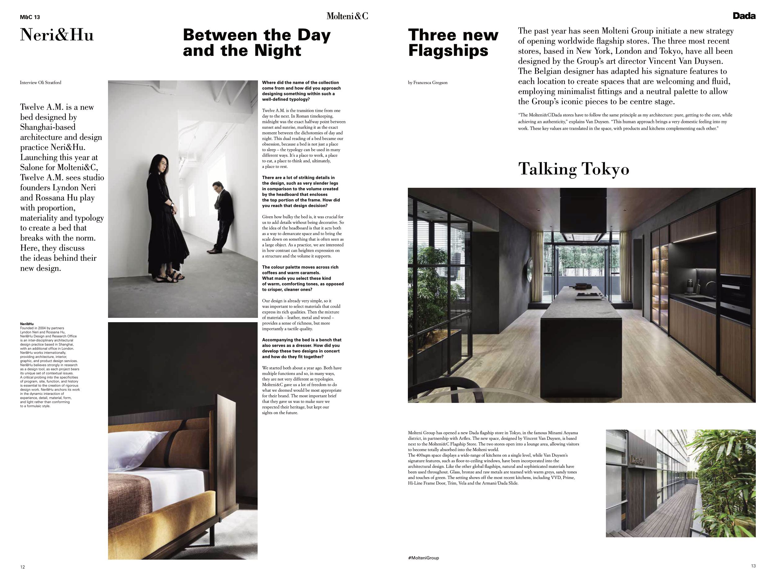
Molteni Group has opened a new Dada flagship store in Tokyo, in the famous Minami Aoyama
district, in partnership with Arflex. The new space, designed by Vincent Van Duysen, is based
next to the Molteni&C Flagship Store. The two stores open into a lounge area, allowing visitors
to become totally absorbed into the Molteni world.
The 400sqm space displays a wide-range of kitchens on a single level, while Van Duysen’s
signature features, such as floor-to-ceiling windows, have been incorporated into the
architectural design. Like the other global flagships, natural and sophisticated materials have
been used throughout. Glass, bronze and raw metals are teamed with warm greys, sandy tones
and touches of green. The setting shows off the most recent kitchens, including VVD, Prime,
Hi-Line Frame Door, Trim, Vela and the Armani/Dada Slide.


