32
33
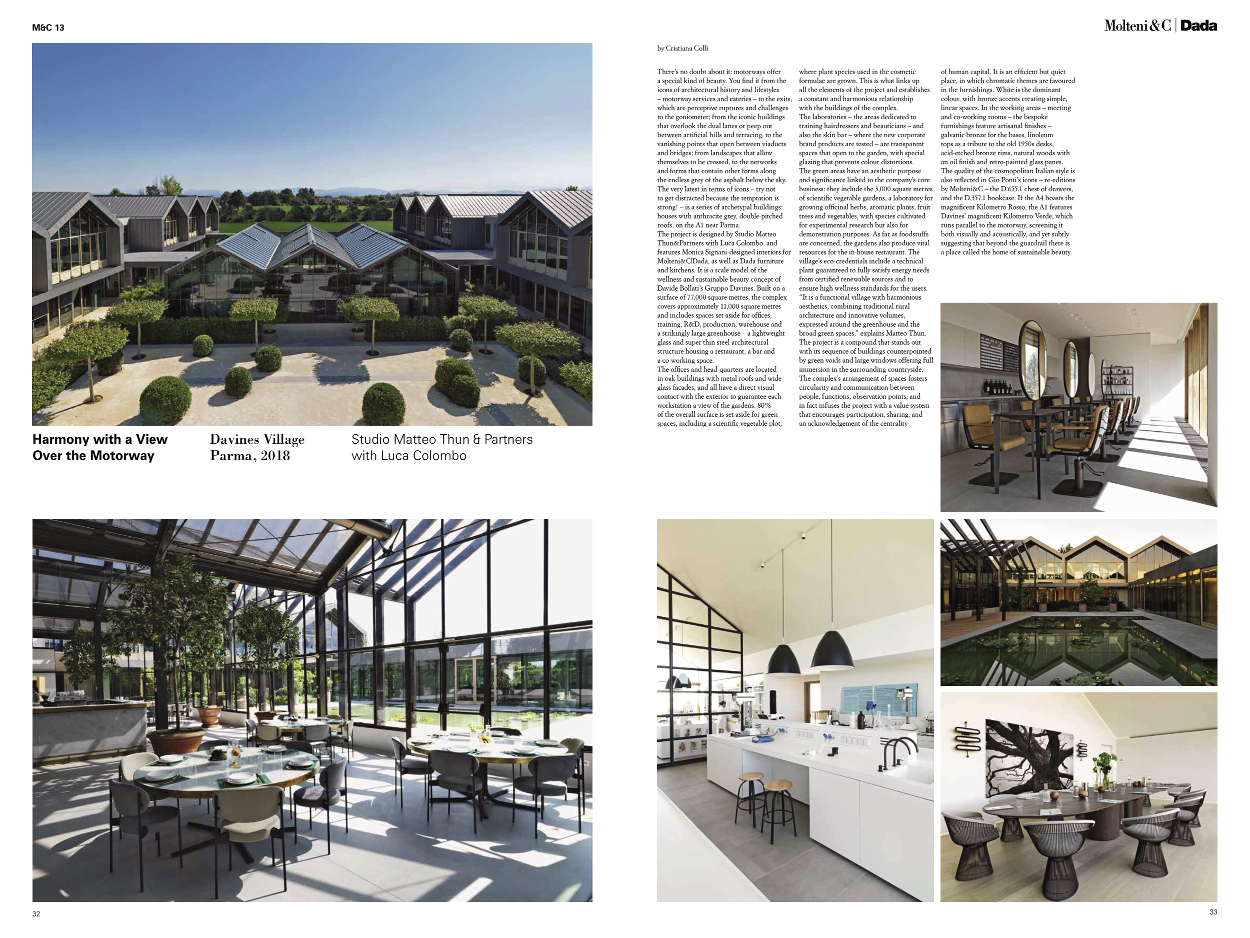
Davines Village
Parma, 2018
Harmony with a View
Over the Motorway
Studio Matteo Thun & Partners
with Luca Colombo
by Cristiana Colli
M&C 13
There’s no doubt about it: motorways offer
a special kind of beauty. You find it from the
icons of architectural history and lifestyles
– motorway services and eateries – to the exits,
which are perceptive ruptures and challenges
to the goniometer; from the iconic buildings
that overlook the dual lanes or peep out
between artificial hills and terracing, to the
vanishing points that open between viaducts
and bridges; from landscapes that allow
themselves to be crossed, to the networks
and forms that contain other forms along
the endless grey of the asphalt below the sky.
The very latest in terms of icons – try not
to get distracted because the temptation is
strong! – is a series of archetypal buildings:
houses with anthracite grey, double-pitched
roofs, on the A1 near Parma.
The project is designed by Studio Matteo
Thun&Partners with Luca Colombo, and
features Monica Signani-designed interiors for
Molteni&C|Dada, as well as Dada furniture
and kitchens. It is a scale model of the
wellness and sustainable beauty concept of
Davide Bollati’s Gruppo Davines. Built on a
surface of 77,000 square metres, the complex
covers approximately 11,000 square metres
and includes spaces set aside for offices,
training, R&D, production, warehouse and
a strikingly large greenhouse – a lightweight
glass and super thin steel architectural
structure housing a restaurant, a bar and
a co-working space.
The offices and head-quarters are located
in oak buildings with metal roofs and wide
glass facades, and all have a direct visual
contact with the exterior to guarantee each
workstation a view of the gardens. 80%
of the overall surface is set aside for green
spaces, including a scientific vegetable plot,
where plant species used in the cosmetic
formulae are grown. This is what links up
all the elements of the project and establishes
a constant and harmonious relationship
with the buildings of the complex.
The laboratories – the areas dedicated to
training hairdressers and beauticians – and
also the skin bar – where the new corporate
brand products are tested – are transparent
spaces that open to the garden, with special
glazing that prevents colour distortions.
The green areas have an aesthetic purpose
and significance linked to the company’s core
business: they include the 3,000 square metres
of scientific vegetable gardens, a laboratory for
growing officinal herbs, aromatic plants, fruit
trees and vegetables, with species cultivated
for experimental research but also for
demonstration purposes. As far as foodstuffs
are concerned, the gardens also produce vital
resources for the in-house restaurant. The
village’s eco-credentials include a technical
plant guaranteed to fully satisfy energy needs
from certified renewable sources and to
ensure high wellness standards for the users.
“It is a functional village with harmonious
aesthetics, combining traditional rural
architecture and innovative volumes,
expressed around the greenhouse and the
broad green spaces,” explains Matteo Thun.
The project is a compound that stands out
with its sequence of buildings counterpointed
by green voids and large windows offering full
immersion in the surrounding countryside.
The complex’s arrangement of spaces fosters
circularity and communication between
people, functions, observation points, and
in fact infuses the project with a value system
that encourages participation, sharing, and
an acknowledgement of the centrality
of human capital. It is an efficient but quiet
place, in which chromatic themes are favoured
in the furnishings. White is the dominant
colour, with bronze accents creating simple,
linear spaces. In the working areas – meeting
and co-working rooms – the bespoke
furnishings feature artisanal finishes –
galvanic bronze for the bases, linoleum
tops as a tribute to the old 1950s desks,
acid-etched bronze rims, natural woods with
an oil finish and retro-painted glass panes.
The quality of the cosmopolitan Italian style is
also reflected in Gio Ponti’s icons – re-editions
by Molteni&C – the D.655.1 chest of drawers,
and the D.357.1 bookcase. If the A4 boasts the
magnificent Kilometro Rosso, the A1 features
Davines’ magnificent Kilometro Verde, which
runs parallel to the motorway, screening it
both visually and acoustically, and yet subtly
suggesting that beyond the guardrail there is
a place called the home of sustainable beauty.


