Oggi nel progetto Manerba tutti i colori del-
le palette sono disponibili su tutte le super-
fici. Sembra facile ma guardatevi attorno e
vedrete che non è così.
Questo risultato è il frutto di una ricerca
sul colore e sulle finiture, sviluppata con la
direzione artistica dell’architetto Raf aella
Mangiarotti dal 2011, definendo un ampio
scenario di mood cromatici.
Dai colori neutri e chiari ispirati al gusto
scandinavo, ai mood vivaci e mediterranei,
a quelli tecno con dettagli fluo e elettrici, a
quelli più classici. Lo stesso impegno hanno
richiesto le finiture dei metalli: dalle classi-
che cromature a tutto lo spettro delle fini-
ture che simulano i metalli più nobili, nuovi e
invecchiati. Analoga ricerca anche sui legni,
sui laminati e sui tessuti.
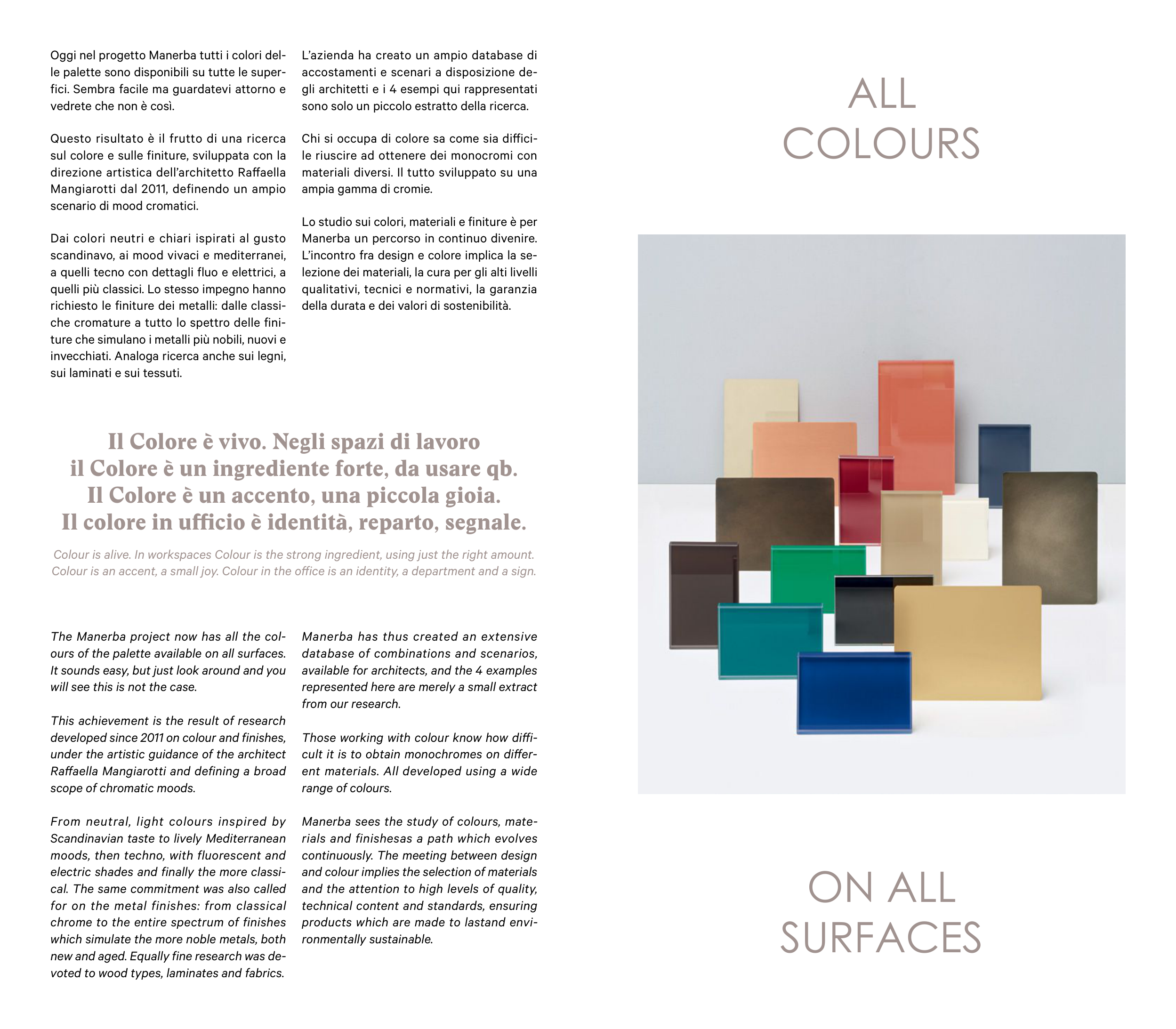
L’azienda ha creato un ampio database di
accostamenti e scenari a disposizione de-
gli architetti e i 4 esempi qui rappresentati
sono solo un piccolo estratto della ricerca.
Chi si occupa di colore sa come sia dif ici-
le riuscire ad ottenere dei monocromi con
materiali diversi. Il tutto sviluppato su una
ampia gamma di cromie.
Lo studio sui colori, materiali e finiture è per
Manerba un percorso in continuo divenire.
L’incontro fra design e colore implica la se-
lezione dei materiali, la cura per gli alti livelli
qualitativi, tecnici e normativi, la garanzia
della durata e dei valori di sostenibilità.
The Manerba project now has all the col-
ours of the palette available on all surfaces.
It sounds easy, but just look around and you
will see this is not the case.
This achievement is the result of research
developed since 2011 on colour and finishes,
under the artistic guidance of the architect
Raf aella Mangiarotti and defining a broad
scope of chromatic moods.
From neutral, light colours inspired by
Scandinavian taste to lively Mediterranean
moods, then techno, with fluorescent and
electric shades and finally the more classi-
cal. The same commitment was also called
for on the metal finishes: from classical
chrome to the entire spectrum of finishes
which simulate the more noble metals, both
new and aged. Equally fine research was de-
voted to wood types, laminates and fabrics.
Manerba has thus created an extensive
database of combinations and scenarios,
available for architects, and the 4 examples
represented here are merely a small extract
from our research.
Those working with colour know how dif i-
cult it is to obtain monochromes on dif er-
ent materials. All developed using a wide
range of colours.
Manerba sees the study of colours, mate-
rials and finishesas a path which evolves
continuously. The meeting between design
and colour implies the selection of materials
and the attention to high levels of quality,
technical content and standards, ensuring
products which are made to lastand envi-
ronmentally sustainable.
Il Colore è vivo. Negli spazi di lavoro
il Colore è un ingrediente forte, da usare qb.
Il Colore è un accento, una piccola gioia.
Il colore in uf cio è identità, reparto, segnale.
Colour is alive. In workspaces Colour is the strong ingredient, using just the right amount.
Colour is an accent, a small joy. Colour in the of ice is an identity, a department and a sign.
ON ALL
SURFACES
ALL
COLOURS