233
Dolmen
Tuareg
Tobia
Uptown
Big Bang
Allegro
Bahia
Foscarini
Chap. 5 — Designing space with light
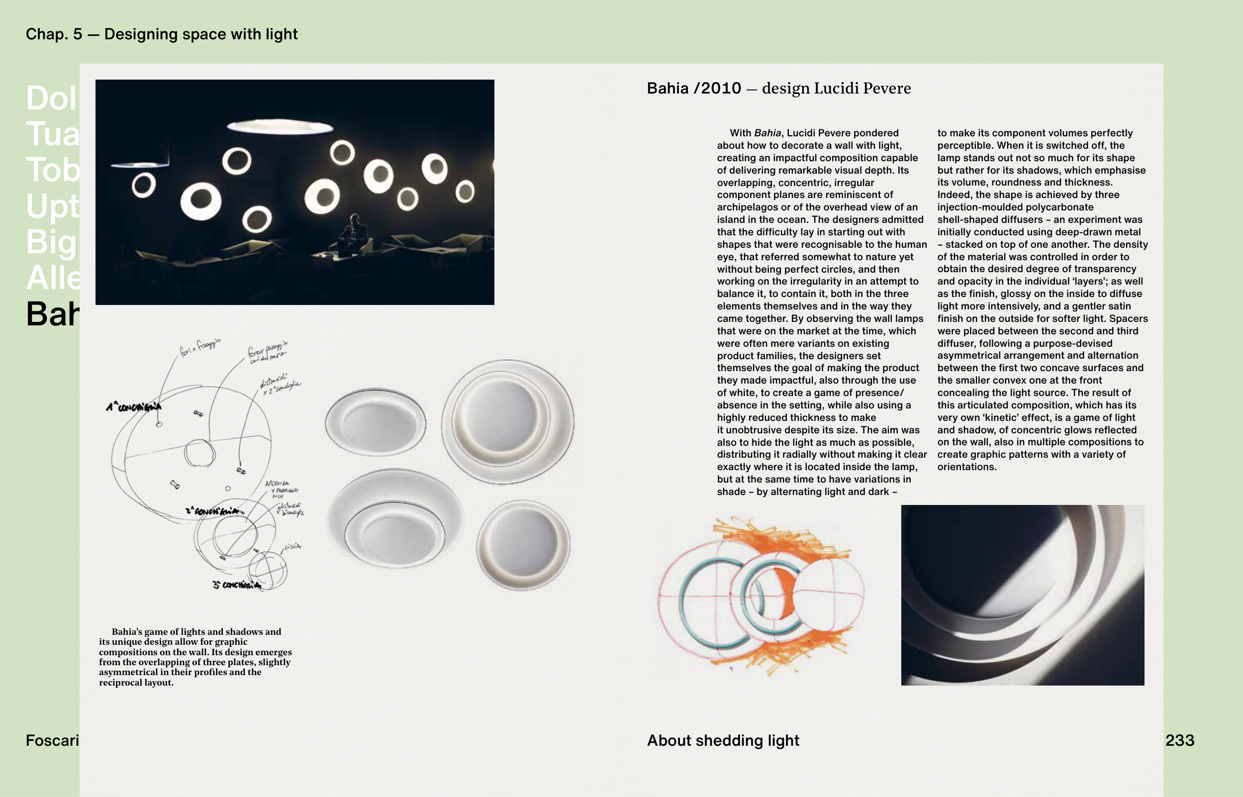
Bahia’s game of lights and shadows and
its unique design allow for graphic
compositions on the wall. Its design emerges
from the overlapping of three plates, slightly
asymmetrical in their profi les and the
reciprocal layout.
Bahia /2010 — design Lucidi Pevere
About shedding light
With Bahia, Lucidi Pevere pondered
about how to decorate a wall with light,
creating an impactful composition capable
of delivering remarkable visual depth. Its
overlapping, concentric, irregular
component planes are reminiscent of
archipelagos or of the overhead view of an
island in the ocean. The designers admitted
that the diffi culty lay in starting out with
shapes that were recognisable to the human
eye, that referred somewhat to nature yet
without being perfect circles, and then
working on the irregularity in an attempt to
balance it, to contain it, both in the three
elements themselves and in the way they
came together. By observing the wall lamps
that were on the market at the time, which
were often mere variants on existing
product families, the designers set
themselves the goal of making the product
they made impactful, also through the use
of white, to create a game of presence/
absence in the setting, while also using a
highly reduced thickness to make
it unobtrusive despite its size. The aim was
also to hide the light as much as possible,
distributing it radially without making it clear
exactly where it is located inside the lamp,
but at the same time to have variations in
shade – by alternating light and dark –
to make its component volumes perfectly
perceptible. When it is switched off, the
lamp stands out not so much for its shape
but rather for its shadows, which emphasise
its volume, roundness and thickness.
Indeed, the shape is achieved by three
injection-moulded polycarbonate
shell-shaped diffusers – an experiment was
initially conducted using deep-drawn metal
– stacked on top of one another. The density
of the material was controlled in order to
obtain the desired degree of transparency
and opacity in the individual ‘layers’; as well
as the fi nish, glossy on the inside to diffuse
light more intensively, and a gentler satin
fi nish on the outside for softer light. Spacers
were placed between the second and third
diffuser, following a purpose-devised
asymmetrical arrangement and alternation
between the fi rst two concave surfaces and
the smaller convex one at the front
concealing the light source. The result of
this articulated composition, which has its
very own ‘kinetic’ effect, is a game of light
and shadow, of concentric glows refl ected
on the wall, also in multiple compositions to
create graphic patterns with a variety of
orientations.
233


