About us
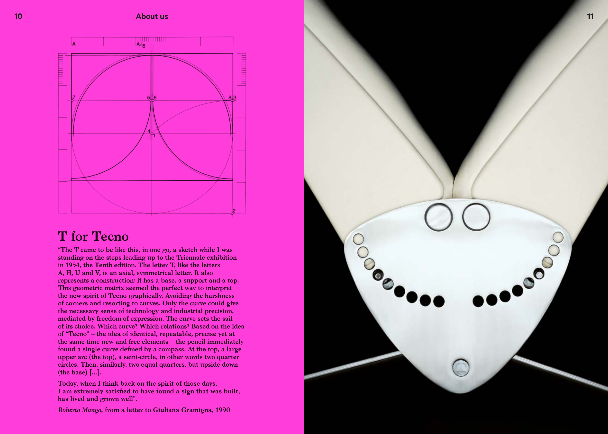
T for Tecno
“The T came to be like this, in one go, a sketch while I was
standing on the steps leading up to the Triennale exhibition
in 1954, the Tenth edition. The letter T, like the letters
A, H, U and V, is an axial, symmetrical letter. It also
represents a construction: it has a base, a support and a top.
This geometric matrix seemed the perfect way to interpret
the new spirit of Tecno graphically. Avoiding the harshness
of corners and resorting to curves. Only the curve could give
the necessary sense of technology and industrial precision,
mediated by freedom of expression. The curve sets the sail
of its choice. Which curve? Which relations? Based on the idea
of “Tecno” – the idea of identical, repeatable, precise yet at
the same time new and free elements – the pencil immediately
found a single curve defined by a compass. At the top, a large
upper arc (the top), a semi-circle, in other words two quarter
circles. Then, similarly, two equal quarters, but upside down
(the base) [...].
Today, when I think back on the spirit of those days,
I am extremely satisfied to have found a sign that was built,
has lived and grown well”.
Roberto Mango, from a letter to Giuliana Gramigna, 1990
11
10