6 –interlübke
interlübke – 7
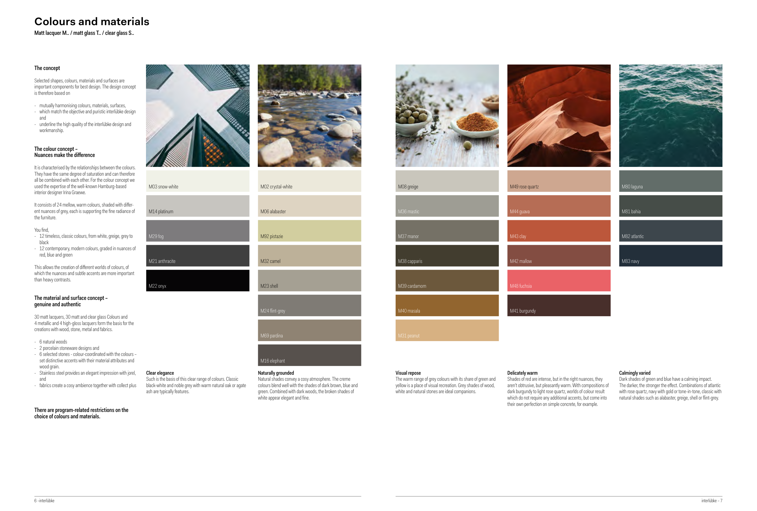
Colours and materials
Matt lacquer M.. / matt glass T.. / clear glass S..
The concept
Selected shapes, colours, materials and surfaces are
important components for best design. The design concept
is therefore based on
- mutually harmonising colours, materials, surfaces,
- which match the objective and puristic interlübke design
and
- underline the high quality of the interlübke design and
workmanship.
The colour concept –
Nuances make the difference
It is characterised by the relationships between the colours.
They have the same degree of saturation and can therefore
all be combined with each other. For the colour concept we
used the expertise of the well-known Hamburg-based
interior designer Irina Graewe.
It consists of 24 mellow, warm colours, shaded with differ-
ent nuances of grey, each is supporting the fine radiance of
the furniture.
You find,
- 12 timeless, classic colours, from white, greige, grey to
black
- 12 contemporary, modern colours, graded in nuances of
red, blue and green
This allows the creation of different worlds of colours, of
which the nuances and subtle accents are more important
than heavy contrasts.
The material and surface concept –
genuine and authentic
30 matt lacquers, 30 matt and clear glass Colours and
4 metallic and 4 high-gloss lacquers form the basis for the
creations with wood, stone, metal and fabrics.
- 6 natural woods
- 2 porcelain stoneware designs and
- 6 selected stones - colour-coordinated with the colours –
set distinctive accents with their material attributes and
wood grain.
- Stainless steel provides an elegant impression with jorel,
and
- fabrics create a cosy ambience together with collect plus
There are program-related restrictions on the
choice of colours and materials.
Naturally grounded
Natural shades convey a cosy atmosphere. The creme
colours blend well with the shades of dark brown, blue and
green. Combined with dark woods, the broken shades of
white appear elegant and fine.
Clear elegance
Such is the basis of this clear range of colours. Classic
black-white and noble grey with warm natural oak or agate
ash are typically features.
M03 snow-white
M14 platinum
M29 fog
M21 anthracite
M22 onyx
M02 crystal-white
M06 alabaster
M23 shell
M24 flint-grey
M16 elephant
M92 pistazie
M32 camel
M69 pardina
Delicately warm
Shades of red are intense, but in the right nuances, they
aren’t obtrusive, but pleasantly warm. With compositions of
dark burgundy to light rose quartz, worlds of colour result
which do not require any additional accents, but come into
their own perfection on simple concrete, for example.
Calmingly varied
Dark shades of green and blue have a calming impact.
The darker, the stronger the effect. Combinations of atlantic
with rose quartz, navy with gold or tone-in-tone, classic with
natural shades such as alabaster, greige, shell or flint-grey.
Visual repose
The warm range of grey colours with its share of green and
yellow is a place of visual recreation. Grey shades of wood,
white and natural stones are ideal companions.
M08 greige
M36 mastic
M37 manor
M38 capparis
M39 cardamom
M40 masala
M49 rose quartz
M44 guava
M42 mallow
M41 burgundy
M80 laguna
M81 bahia
M82 atlantic
M83 navy
M31 peanut
M43 clay
M48 fuchsia