148
WORKS 6 | PALACIO DE HIERRO
SOLUTIONS
The massive scale of the project presented a great challenge, leading the
client to hiring two design firms. One was in charge of the design of the
ground and first floor, whereas the other one developed the design of the
second and fourth floor. The client’s in-house design team oversaw the
whole process and ensured that the project maintained a continuity of vision
and message.
In order to achieve the unique concept envisioned by the designers, Tile was
installed in a recessed plaster ceiling. Not only did this solution hide the
metal structure and the bulbs, but it also created a peculiar niche of light in
the ceiling, further highlighting the geometric shape of the chandelier.
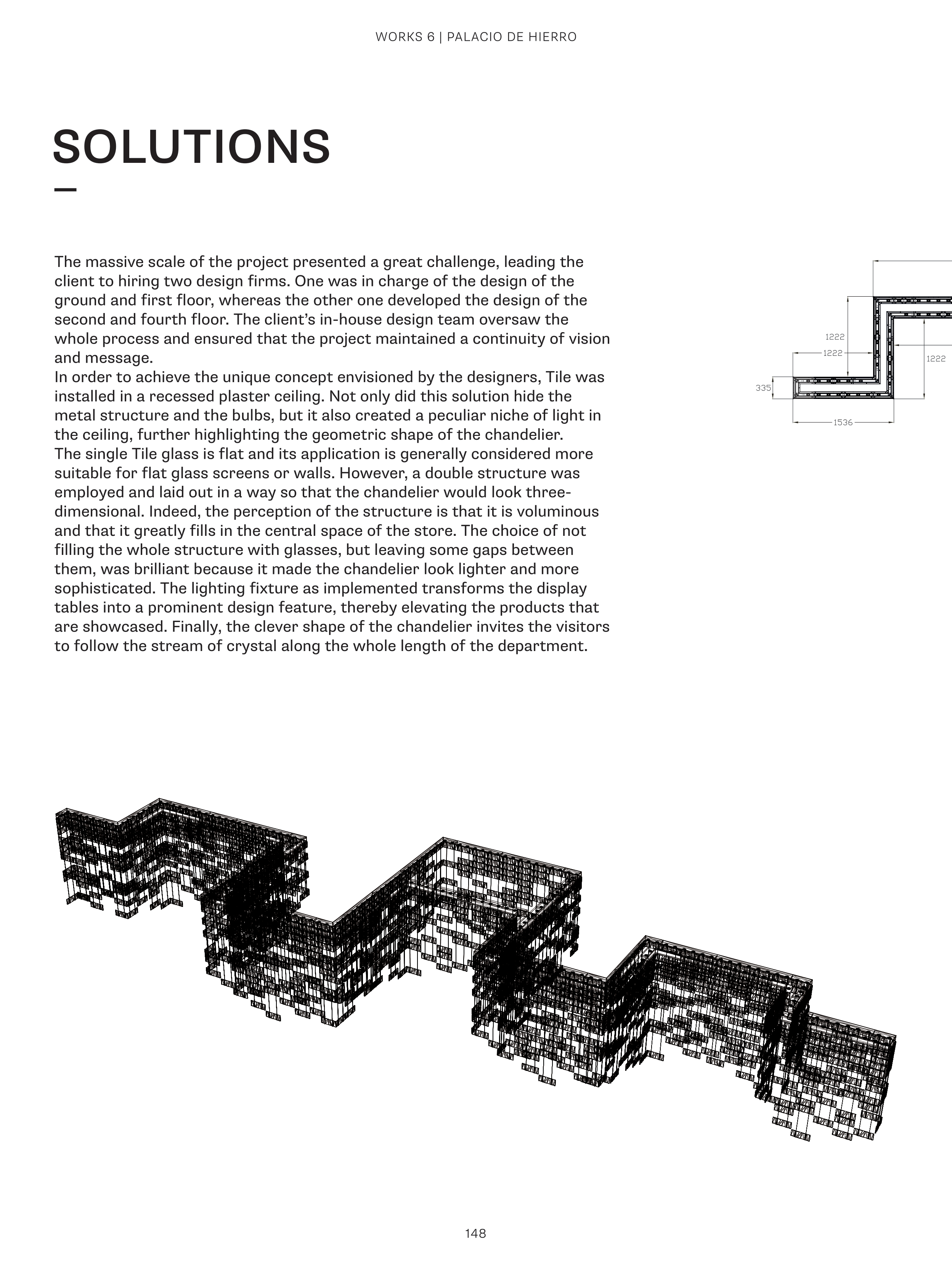
The single Tile glass is flat and its application is generally considered more
suitable for flat glass screens or walls. However, a double structure was
employed and laid out in a way so that the chandelier would look three-
dimensional. Indeed, the perception of the structure is that it is voluminous
and that it greatly fills in the central space of the store. The choice of not
filling the whole structure with glasses, but leaving some gaps between
them, was brilliant because it made the chandelier look lighter and more
sophisticated. The lighting fixture as implemented transforms the display
tables into a prominent design feature, thereby elevating the products that
are showcased. Finally, the clever shape of the chandelier invites the visitors
to follow the stream of crystal along the whole length of the department.


